Information architecture
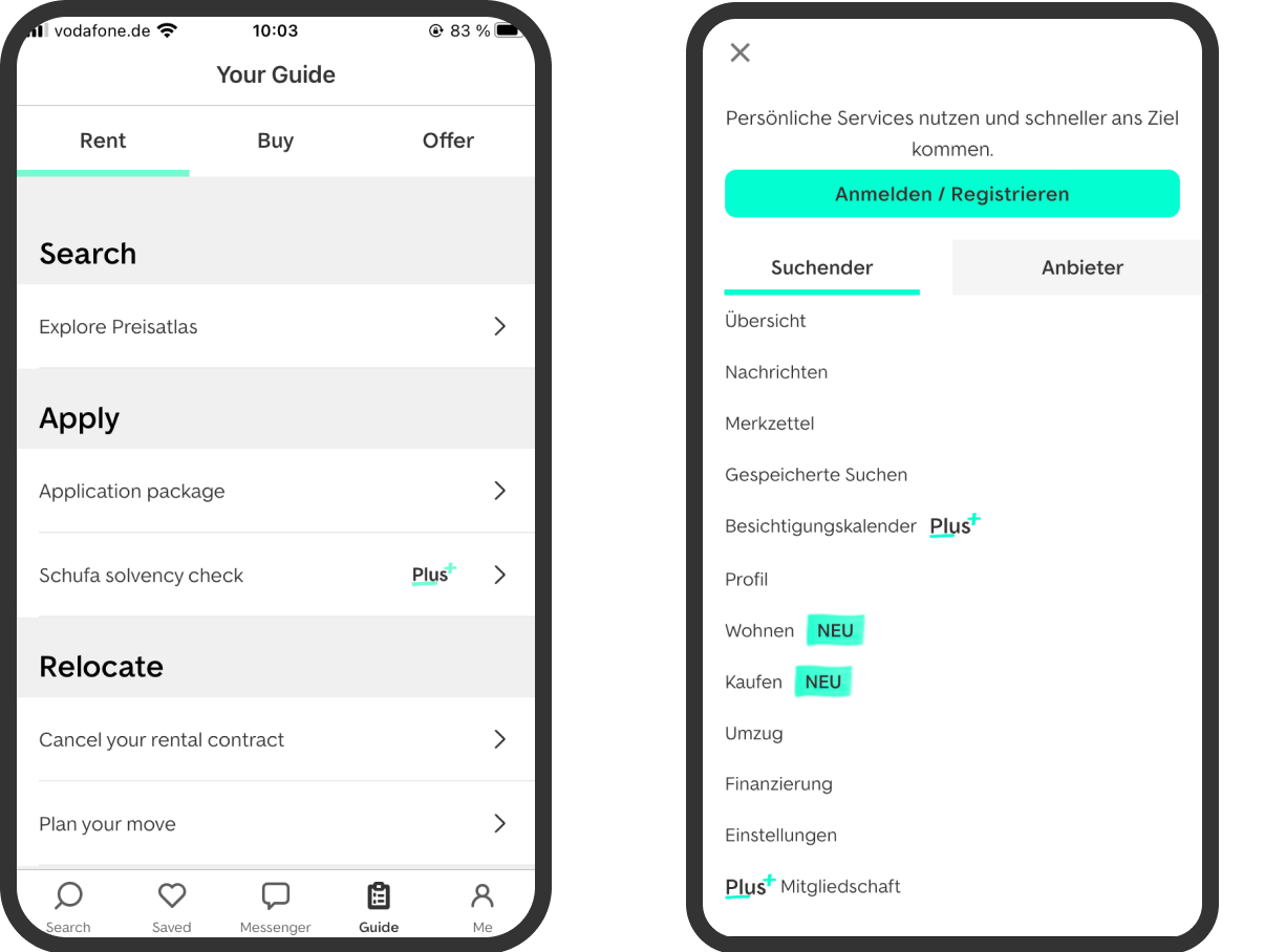
I structured destinations, grouped related services and defined the hierarchy across logged out and logged in states.
Case Study | Navigation Design
I redesigned the navigation across app and web to reduce visual complexity, strengthen strategic destinations and create a clearer logged in experience.
Context
Over time, ImmoScout24 had grown from a property search platform into a broad ecosystem for renters, buyers, owners and property professionals.
The navigation had to represent search, selling, renting, financing, moving, personal services and several internal products. The existing system exposed many of these destinations directly, but it had also become visually dense and difficult to translate consistently across devices.
Before
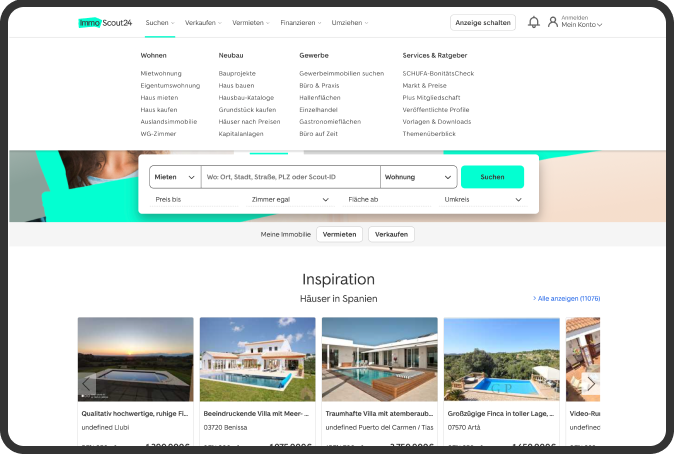
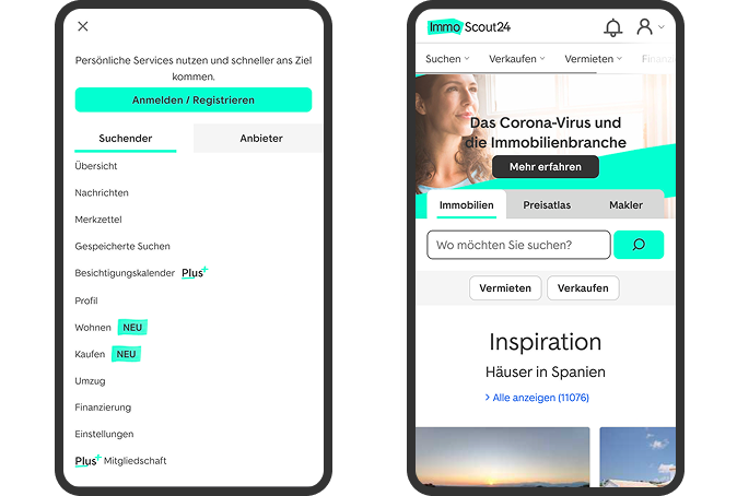
The previous desktop navigation used layered menus that revealed many destinations on hover. This supported discovery because users could see a broad range of services without leaving the current page.
At the same time, the structure contained many levels, competing entry points and different patterns across desktop, mobile web and app.
Strategic Direction
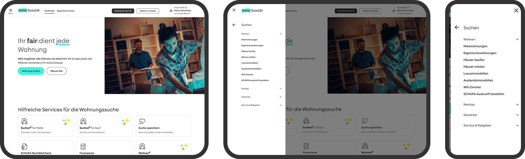
Management defined simplicity as the strategic direction for the redesign.
The challenge was not only to remove visible elements. The new system still had to represent a large product ecosystem, support commercial priorities and provide clear access across app and web.
My task was to translate this direction into a navigation model that remained understandable across platforms.
My Role
Information Architecture
Stakeholder Alignment
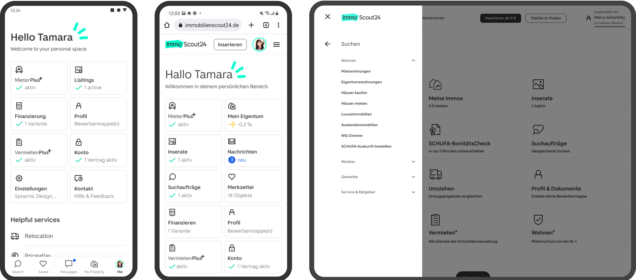
Logged In Experience
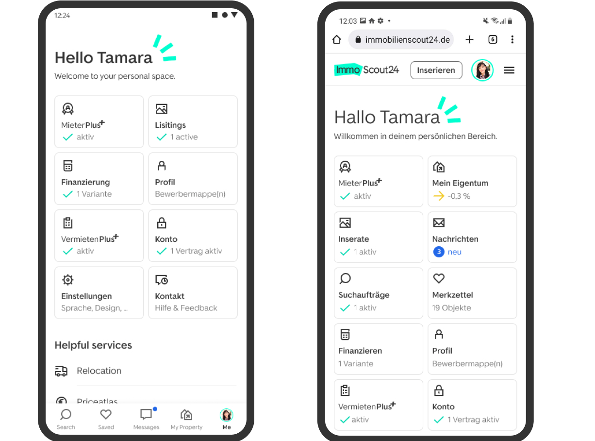
The previous logged in experience relied on long menus that mixed messages, saved searches, account settings, contracts and product services.
I reorganised these destinations into a clearer personal area with stronger grouping, simpler labels and more visible status information.
The new experience reduced visual overload and made the relationship between account functions and product services easier to understand.
Validation
Outcome
Learning
Navigation design does more than organise links.
It redistributes attention, access and business value across the product.
The project reinforced that removing visible options can improve clarity while also changing which parts of a marketplace users discover.
Next
Contact
 LinkedIn