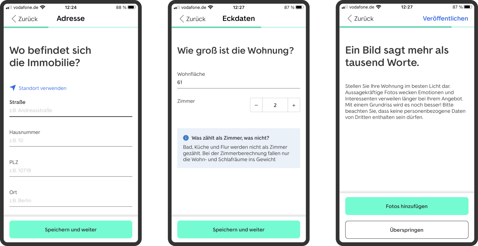
Make effort visible
A transparent one-page structure reduced the feeling of being trapped inside a long wizard.
Case Study / Mobile Listing Flow
I redesigned a lengthy native listing wizard into a faster, more transparent creation experience by making the flow feel like building a real listing, not filling a backend form.
The Challenge
ImmoScout24 wanted private landlords to create and publish a rental listing directly from the app within 60 seconds. The existing native flow was functionally complete, but it asked users to move through several screens and made the process feel longer than it needed to be.
The design challenge was not cosmetic. The flow needed a structural rethink: fewer transitions, clearer grouping, visible progress and a stronger sense that users were creating a real listing rather than completing an abstract form.
Design Judgment
A transparent one-page structure reduced the feeling of being trapped inside a long wizard.
Fields were organized around landlord mental models instead of backend or technical categories.
The final direction balanced speed, usability and what could be delivered inside the native app architecture.
Before / After
Approach
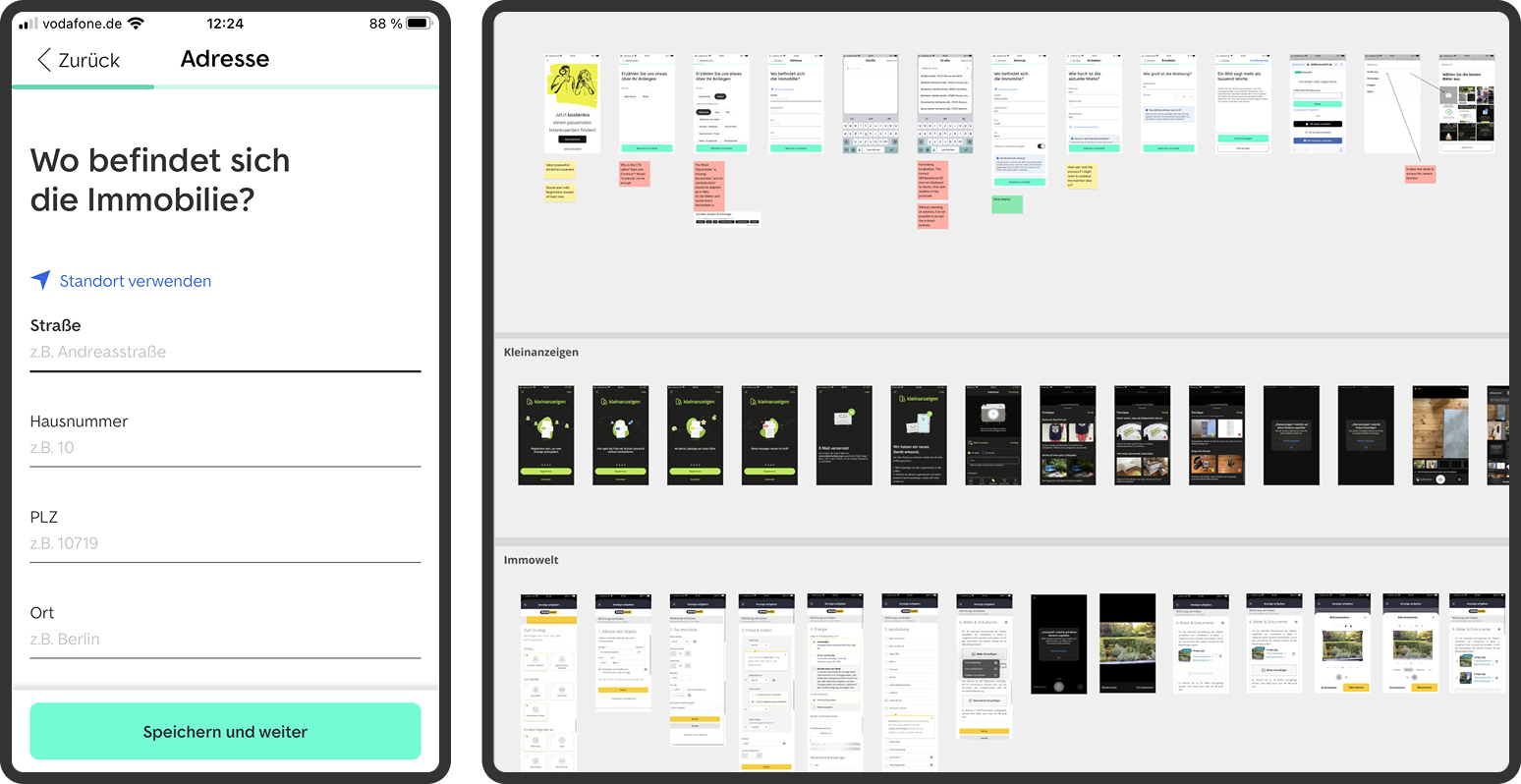
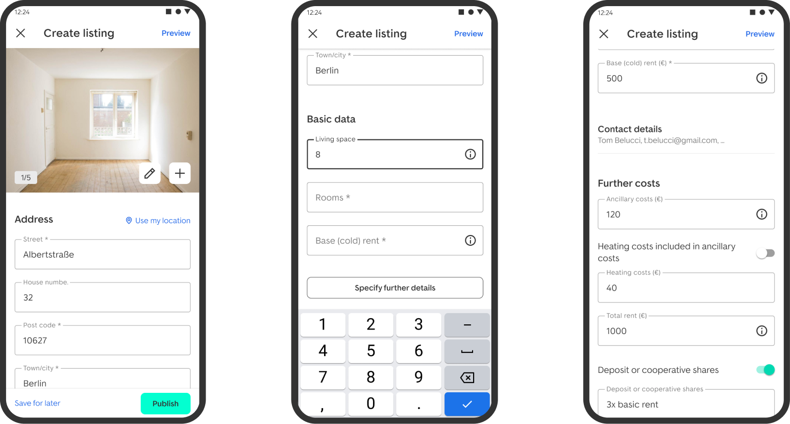
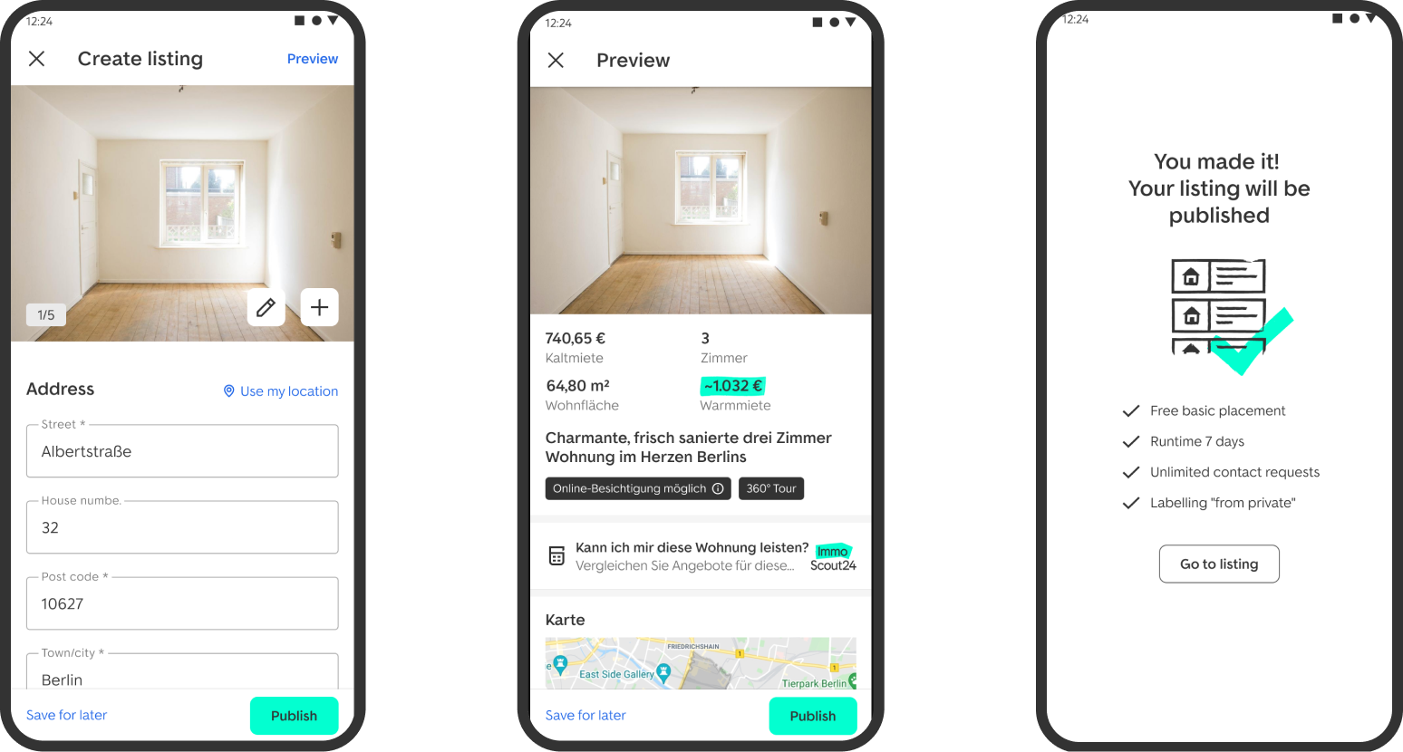
We already had a promising one-page flow on web. I used that pattern as a hypothesis: if users could see the shape of the entire task, the flow would feel shorter and more manageable than the classic multi-step wizard.
The web-based one-pager was brought into the app context and tested against the native flow. The direction showed clear improvements in bounce, dropout and completion speed, strong enough to justify native optimization and rollout.
Research Signals
Users understood the task faster when they could see the structure of the listing creation process.
Grouping inputs by real-world listing context made the flow easier to scan and complete.
The experience felt faster when users had fewer transitions and less uncertainty about what came next.
Impact
Users had a clearer sense of progress, lower perceived effort and higher confidence before publishing.
The project was considered a strong success and supported a lower-friction path through a business-critical listing flow.
Testing and A/B signals showed improvements in bounce, dropout and completion speed, supporting native optimization and rollout.
Learning
The main lesson was that time-to-publish is shaped by more than the number of fields. It is shaped by how effort is framed, how progress is made visible and whether the interface follows the user's mental model.
For this project, the 60-second target became a design constraint that helped the team make sharper decisions about hierarchy, grouping and interaction cost.
Next
Contact